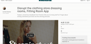
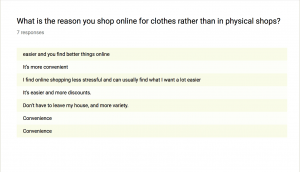
This Kickstarter project is in the same category as my project, it helps people shopping to have the opinion of others on the clothes they have picked so they can make a decision. The idea behind it helps to a certain extent but I feel this wouldn’t work in the media industry and it could be abused, people commenting inappropriately is always a risk.
The layout of the page itself is pretty bad, they have a promo video which is a bit cringe worthy but does get the point across. Below the video is a whole load of text, no exciting headers to break it up just big paragraphs. Below that is a poorly done image of how the app would work which looks like it was done on word. It only received $12 of funding which I would say is not too harsh considering the poor advertising.
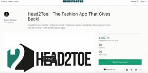
This project is similar to mine in the sense it has an app and is for the fashion industry. This crow-funding page for Head2Toe is very well laid out with lots of useful information, chatty tone and a clear promo video. However, i’m still struggling to understand exactly how it works but it seems rewarding for its users. The page has a lot of mock ups and gives an exact indication of how the app will be used with a very clear idea.
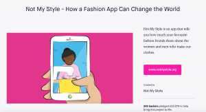
This crowd funding page is for an App which gives information to its users on how their clothes were made and if it was ethical. This allows shoppers to know exactly where their clothes are coming from. The crow funding page itself was very well laid out, they met their funding target and I think this was down to their successful campaign. There was relevant information which stated clearly what the product does and what problem it is solving. this is something I will take in to consideration for my own page.
